Mark Holliday
Code Cleanup, Responsive Design
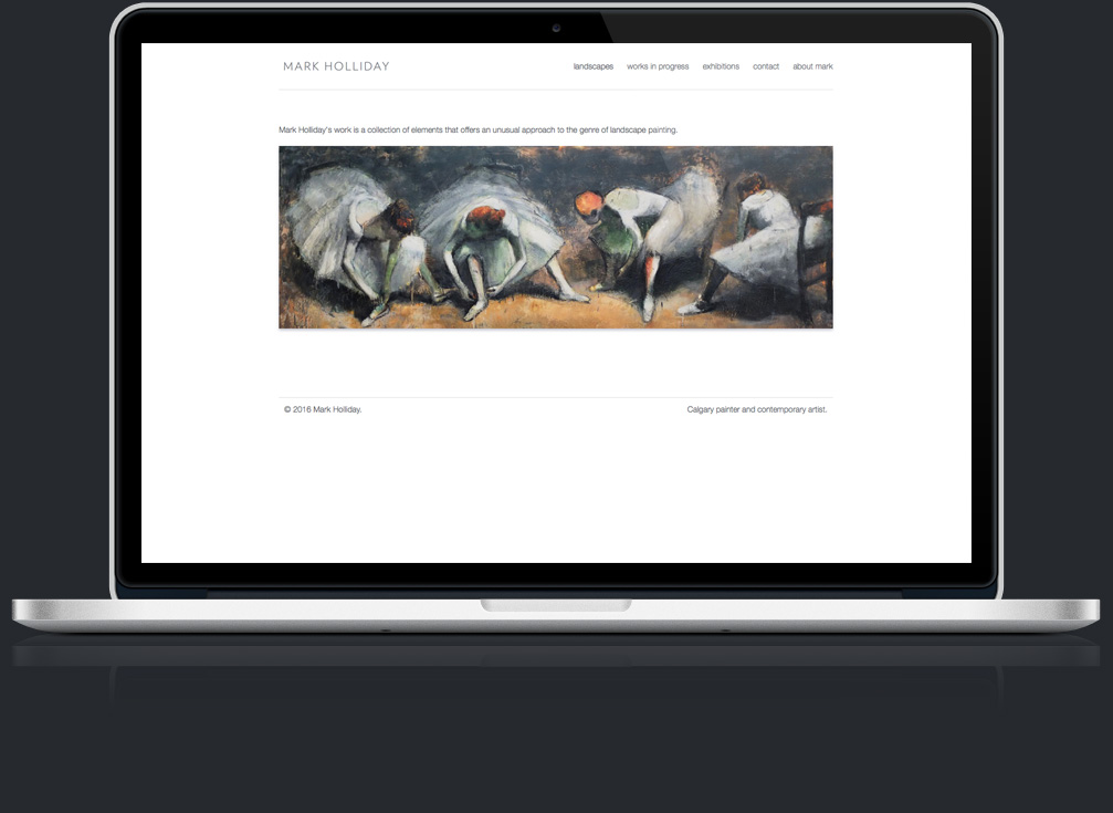
Mark Holliday is a Calgary-based contemporary artist working in unique and unusual ways with the centuries-old mediums of paint and wax. He loved the design of his existing portfolio site, but it was built on an extremely old CMS, so the generated code was poor and it wasn't at all responsive.
I worked with Mark to update his portfolio with a cleaned-up version of his existing design, and vastly improved the code the site ran on. He gets to stick with the CMS he knows how to use, while enjoying a fully-responsive, modern design.
Glenn Solomon: Going Long
Wireframing, Responsive Design, WordPress Development
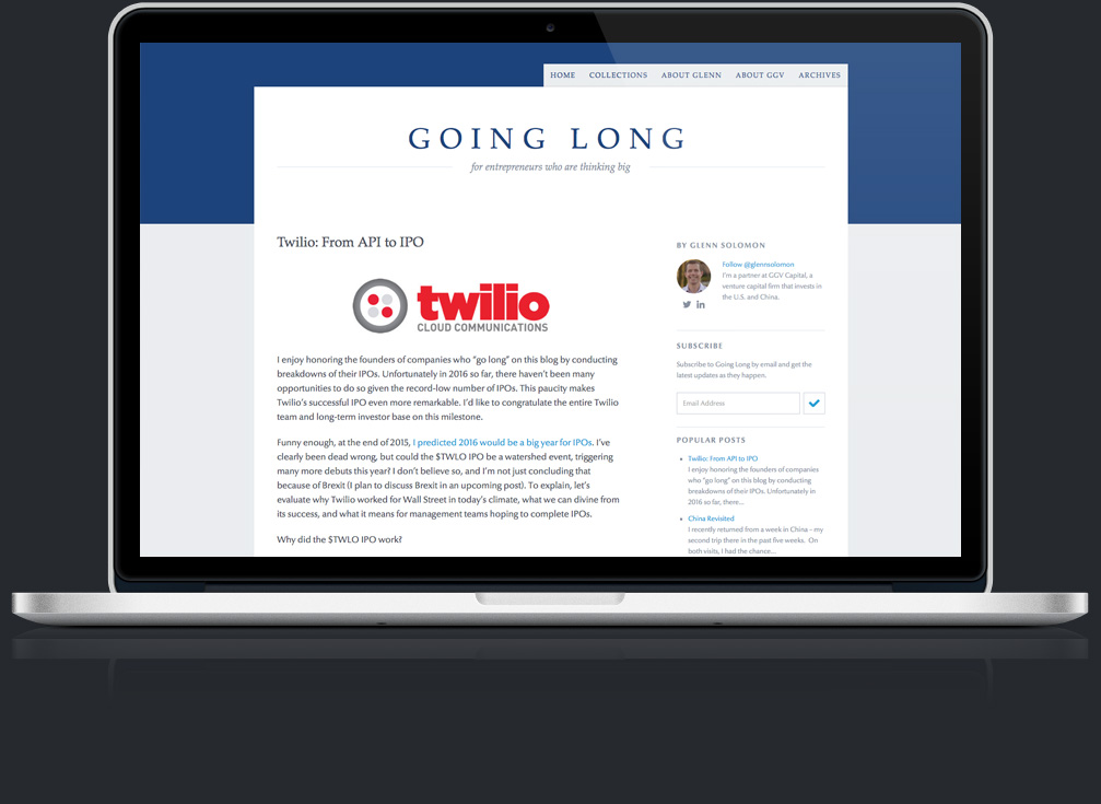
Glenn Solomon expressed a desire to overhaul "Going Long", his weblog and resource to "growth-stage entrepreneurs who are thinking big". He felt the content was great, but that it was difficult to find related and older entries, and that collections of posts weren't being adequately collated. He also wished to make it more accessible to mobile readers, and to generally clean up the layout.
Through a series of short phone discussions, Mr. Solomon and I worked through wireframing the site and established what content would be removed (the embedded sidebar Twitter feed, for instance), what content would remain, and what features would be added. The site's rich blue accent colour was pulled from the previous incarnation of the site, and is one of the colour choices for the signature "#golong" t-shirts.
Two of the biggest features added to the site were related posts and automatically-collated Collections. I built a plugin to handle the former, while the latter repurposed WordPress categories as a novel and convenient way for Mr. Solomon to write episodic posts in a single series. If Mr. Solomon chooses to create a new Collection of posts, the setup process is extremely simple using the thorough documentation I provided.
Bullpen Capital
Wireframing, Identity, Responsive Design, WordPress Development
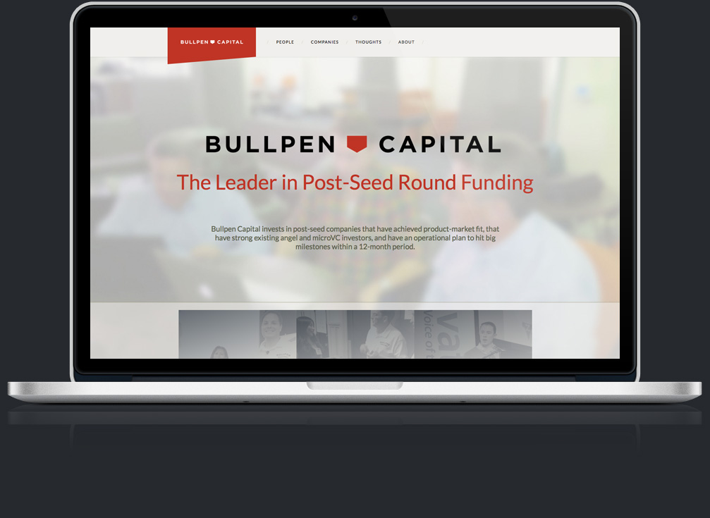
Bullpen Capital is a post-seed round fund based on Sand Hill Road, with investments in Zynga, Ness, Chartio, About.me, and other notable companies. They were looking for a very clean and bright website to replace their previously cluttered, dark one.
The "bullpen" metaphor played to the colour scheme choices of bright red and sand colours. However, Bullpen Capital was not set on retaining all sports and baseball metaphors. Therefore, the page titles were made clearer, and the company's blog was made more prominent. I also handled the seamless transition of the site from its previous Wix incarnation to the new self-hosted WordPress site.
Haystack
Wireframing, Identity, Responsive Design, WordPress Integration
Investor and publisher Semil Shah was looking to refresh his Haywire brand by giving it a more academic and professional vibe. I presented a few concepts for both the website and identity; after working with some of those ideas, I developed a responsive WordPress theme suitable for posting long articles, shorter posts, and video content.
The key to this site lay in two words which came up during the design process: "academic" and "identifiable". I spent a long time working on typographical choices which I realized could accomplish both goals. The final type selection, combined with the subdued colour palette, gives the site a refined quality, but which is also welcoming.
Photoshelter Beam: “Promenade” Theme
Responsive Design
Photoshelter was redeveloping their advanced portfolio and archival system for photographers and were seeking new templates. From initial wireframes to a pixel-perfect delivery, I designed a clean, flexible theme with a variety of colour choices and font pairings. The theme is also responsive for mobile and tablet users.
The minimalist theme is particularly effective in being deferential to the photography, letting it shine. The use of simple shape icons and flatter textures allows for end-user flexibility with both type choices and colour palettes.
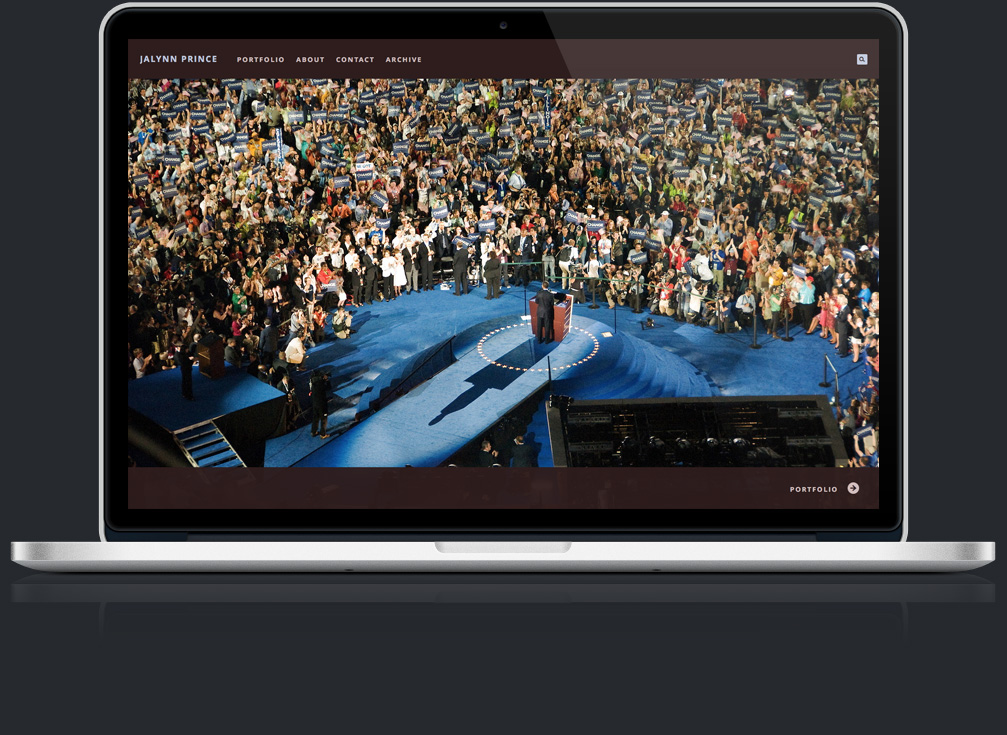
Screenshots used with thanks to JaLynn Prince and Espen Rasmussen.
Why did you choose the Promenade template for your new Beam website?
The homepage is what sold me on the Promenade template. I like the juxtaposition between the homepage and the tiled portfolio page. I also like the full-width layout of just one image.
What is the template you are using and what made you choose this particular template to showcase your work?
I use the Promenade template. The combination of a clean layout, a single-image start page, and a logical way to organize my stories makes this template perfect for my needs.
Nuit Blanche Calgary
WordPress Implementation, Web Marketing Consulting
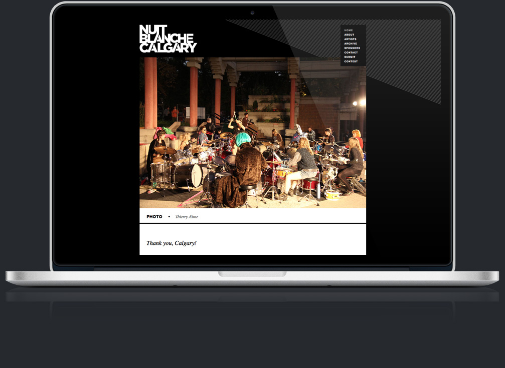
Nuit Blanche approached me to implement a website design in a way that anyone on staff could update it. Most of the staff was very familiar with WordPress, so it was a good fit.
The team was very interested in ensuring that their Facebook updates were seen on the website. The designer and I had a look at all of Facebook's embedding options and decided that none of them fit with the website. I wrote a simple custom plugin to link to recent updates in a style which integrates seamlessly with the rest of the site.
SitePen Blog
Research, Responsive Design (Unused)
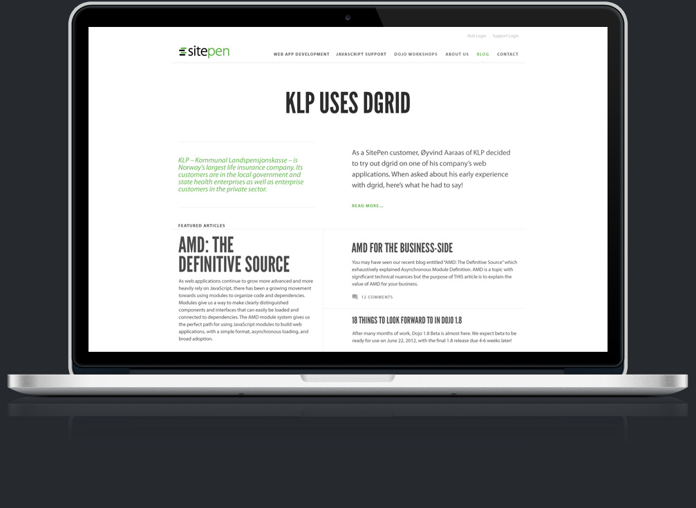
SitePen sought to redesign their company blog in a style evocative of online and printed newspapers. I proposed a clever subject-based asynchronous presentation for sorting and reading articles on the homepage, and I created mockups of several pages in both desktop and mobile views.
Manuel Ermecheo
Personal Identity
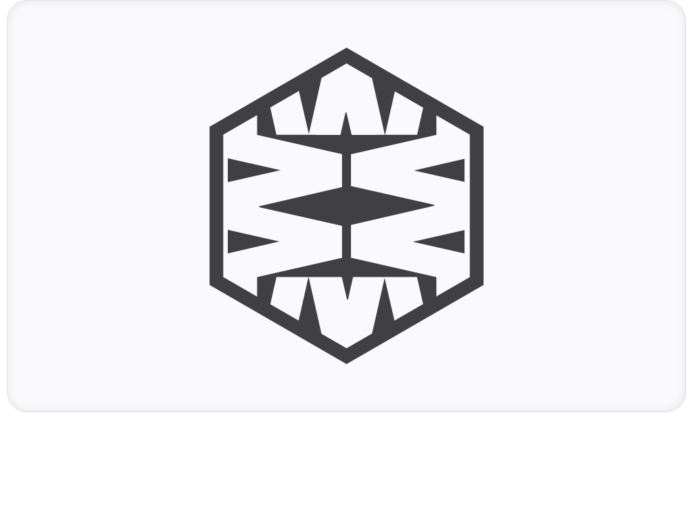
Manuel's initials are Spanish for “honey”, which provided the hexagon. I deliberately avoided anything beyond shape with Ermecheo’s identity, as it allows him plenty of flexibility in its use. He has so far used it as a mask for video, a watermark, created a vinyl cutout, and provided plenty of other use cases that show the advantage of its simplicity.
Pixel Envy
Design & Responsive WordPress Implementation
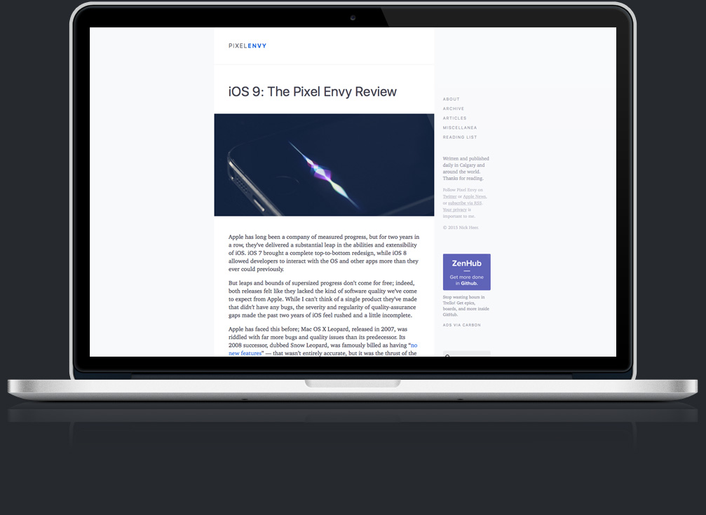
I designed and implemented the theme for my weblog. Articles are text-dense, and of widely varying lengths — from a single word to around 20,000.
Articles I've written have been linked to from Daring Fireball, Loop Insight, MacStories, and the Guardian, and have been cited by Macworld, PC World, Nylon magazine, Ars Technica, the U.S. Department of Labor, NBC News, Newsweek, Complex, and others.